
31 August 2005
Yet more Billy
I knew I used to have something where he got into Mayan stuff (on a CD that's one of the many victims of my peripatetic lifestyle), and I've found it again - this time with a snazzy animation attached: Ah Pook is here.

29 August 2005
Ha ha
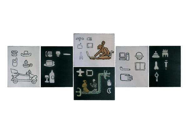
I've sussed out what my entry will be. Funnily enough, it's a variation on the six-panel thing I was working on and abandoned, but using canvases that worked instead of the ones that didn't. I call it Signs of a doomed civilisation.
I've used Blogger's upload pic function again. Click on the sucker to see a slightly bigger version.
Time to freak out
A friend of mine reminded me today that Wallace Award entries need to be in by Thursday. I'm not sure what I'll put in, but will try to suss it out this evening.
Uncharacteristic political post
I really can't see National winning the election. They don't have anything like a credible alternative government. Even the Guardian is amazed at how amateur hour Brash is.
Now it turns out that his coup was backed by New Right ideologues. What a surprise. No wonder he's keen to find out who's leaking this stuff.
Now it turns out that his coup was backed by New Right ideologues. What a surprise. No wonder he's keen to find out who's leaking this stuff.
28 August 2005
Some more Billy
This article is about Billy Burroughs' pictures. I really like the early collages and Shot Sherriff ones, but not the later paintings.
Billy
Along with a lot of other things I was into when I was younger I'm getting back into Billy Burroughs.
27 August 2005
Some blithering about art
What makes a good work of art a good work of art? There've been many different answers over the years. For most of the last 500, a good work of art has been (broadly speaking) pretty narrowly defined as a technically well executed history painting. After modernism though that all changed. There was a time when a good work of art was defined as a specific type of abstract painting, but that of course is thankfully no longer the case. Nowadays, a good work of art is usually defined as anything presented as art that makes you question (or something like that).
That's one way of looking at it anyway. What about a historically independent definition of good art, one that you can apply equally well to a 15th century religious altarpiece, an early modernist abstraction, or a contemporary anything? One old idea that I think has legs is that in a good work of art form and content reinforce each other. I prefer to think of it as the visual and the conceptual reinforcing each other. Something that looks good but that is vapid is obviously not as good as something that looks good that is not vapid, but something where looking good and meaning something are mutually interdependent is even better.
I don't think I'm explaining myself very well. Looking good is obviously subjective. I personally like cool, calm, balanced pictures. Other people like vibrant, bright, busy pictures. It's not maths - there's no proof either way - so the visual style of a picture can't be a determinant of whether it's good or not. Take Piero della Francesca's Baptism for example, it's not the visual style of the picture that makes it great but how he's encoded the meaning of it into the structure of it, at all sorts of levels from the geometric construction of the composition to the paint treatment of the River Jordan.
Of course, once again it's not like maths. The meaning in the Baptism is totally unlike the meaning of 2 + 2 = 4 - different people get different meanings out of the picture but I sincerely hope they don't out of the equation. The meaning of a work of art resides in the associations that work provokes in the mind of the viewer. However, this still gives us a somewhat objective measuring stick. Lots of people get lots out of the Baptism because there's so much in there to be got.
Art's a funny business. People worry about who's hot and who's not, who's in which gallery, who's selling for how much. It's important to remember none of that stuff matters. What matters is doing good shit and getting it out there any way you can.
That's one way of looking at it anyway. What about a historically independent definition of good art, one that you can apply equally well to a 15th century religious altarpiece, an early modernist abstraction, or a contemporary anything? One old idea that I think has legs is that in a good work of art form and content reinforce each other. I prefer to think of it as the visual and the conceptual reinforcing each other. Something that looks good but that is vapid is obviously not as good as something that looks good that is not vapid, but something where looking good and meaning something are mutually interdependent is even better.
I don't think I'm explaining myself very well. Looking good is obviously subjective. I personally like cool, calm, balanced pictures. Other people like vibrant, bright, busy pictures. It's not maths - there's no proof either way - so the visual style of a picture can't be a determinant of whether it's good or not. Take Piero della Francesca's Baptism for example, it's not the visual style of the picture that makes it great but how he's encoded the meaning of it into the structure of it, at all sorts of levels from the geometric construction of the composition to the paint treatment of the River Jordan.
Of course, once again it's not like maths. The meaning in the Baptism is totally unlike the meaning of 2 + 2 = 4 - different people get different meanings out of the picture but I sincerely hope they don't out of the equation. The meaning of a work of art resides in the associations that work provokes in the mind of the viewer. However, this still gives us a somewhat objective measuring stick. Lots of people get lots out of the Baptism because there's so much in there to be got.
Art's a funny business. People worry about who's hot and who's not, who's in which gallery, who's selling for how much. It's important to remember none of that stuff matters. What matters is doing good shit and getting it out there any way you can.
Let's see what this looks like
This is just a wee experiment to check out using Blogger's add image function (instead of uploading images to my website).
Update five seconds later:
Okay, I don't like it. I think I'll stick to the tried and true.
Update ten seconds later:
On reflection, I think that was a bad choice of pic. I might try again with a better one at some later date.
Too much stuff
I've been finding things a bit full on recently - too much stuff going on. I've resigned from my job, though at least this time I've got another one to go to. It's dependent on me getting a security clearence, so one of the things to do this weekend is fill in the 50 million page form detailing everyone I've ever met so the spooks can check me out.
I've also got to track down someone to witness me signing my divorce papers, and reopen negotiations with IRD, but these will be next week's treats. There's also finishing off this thing I'm helping Bek with, and then I think I might be clear to concentrate on my own stuff.
I've also got to track down someone to witness me signing my divorce papers, and reopen negotiations with IRD, but these will be next week's treats. There's also finishing off this thing I'm helping Bek with, and then I think I might be clear to concentrate on my own stuff.
26 August 2005
Change blindness
Those boffins with their whizzy toys have sussed out why we sometimes fail to see big changes right in front of us. They talk about how this is exploited by magicians, but I'm sure there must be some art applications as well.
Subscribe to:
Posts (Atom)
 visitors since 29 March 2004.